
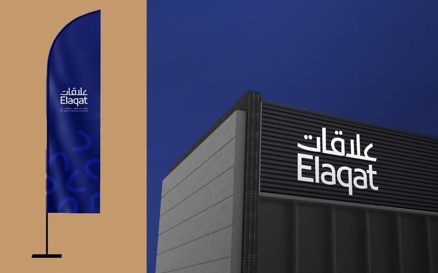
The Idea
A full identity rebrand for Elaqat, a PR and communications firm, replacing a decorative, illustrative emblem with a cleaner, more confident wordmark built to work equally in Arabic and Latin. The previous mark's petal shapes were distilled into a minimal, abstract line motif, carried through as a recurring device across signage, stationery and internal culture touchpoints.
Visual System
BRANDINGIDENTITYLOGO
Adaptations
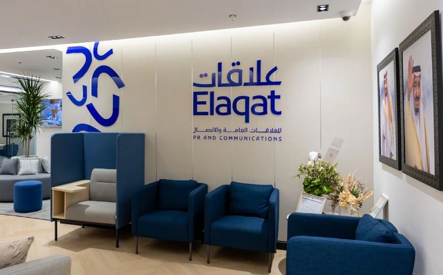
Reception & Interiors
The wordmark carried onto the office's own reception wall.
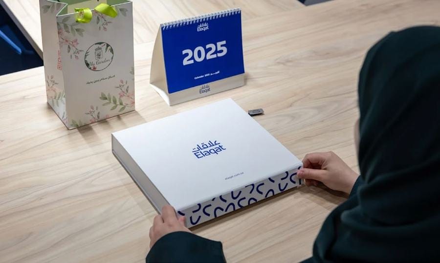
Stationery & Notebook
The line motif embossed onto a branded notebook and gift box.
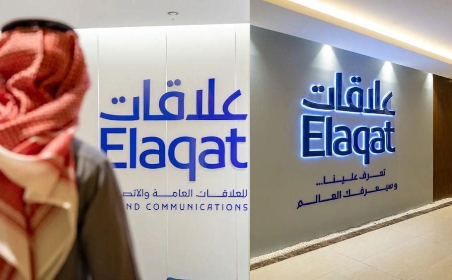
Signage on Site
The Arabic and Latin lockups paired on exterior building signage.
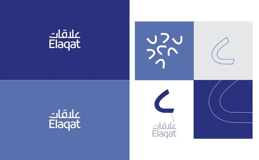
Color & Pattern System
The abstract line motif built out as a tileable brand pattern in two tones.
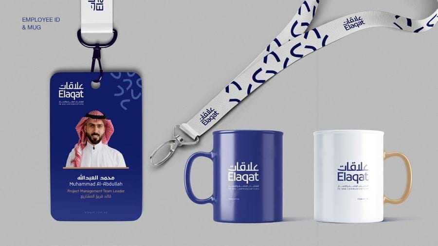
Badge, Lanyard & Mug
Everyday culture touchpoints — ID badge, lanyard and mug — carrying the same mark.
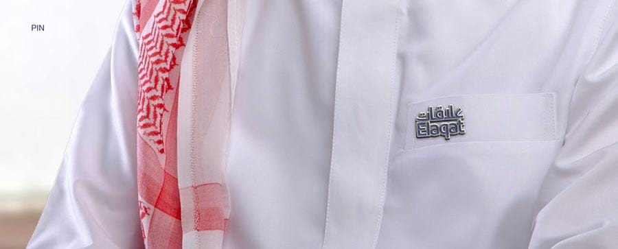
Brand on Uniform
The wordmark applied to internal uniform and event wear.
Next in Brand Identity