
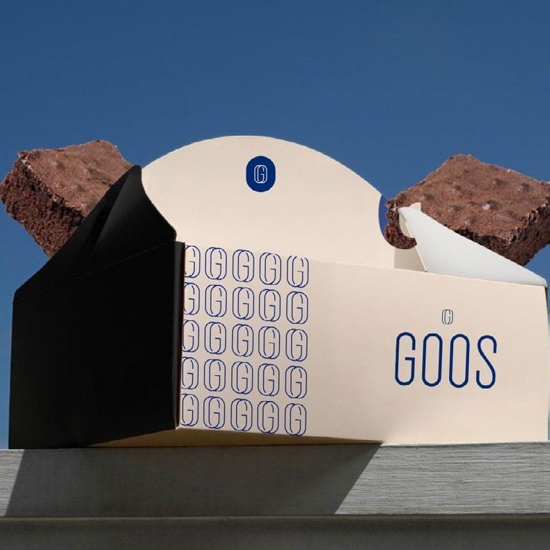
The Idea
An elegant identity for GOOS Bakery, built around a wordmark and a monogram distilled from the brand's own letters — the two O's overlap into a single vesica-shaped icon, framed by curves borrowed from the G and the S. That monogram repeats as a subtle pattern across packaging, from the pastry box to the bread wrap.
Visual System
IDENTITYBRANDINGLOGO
Adaptations
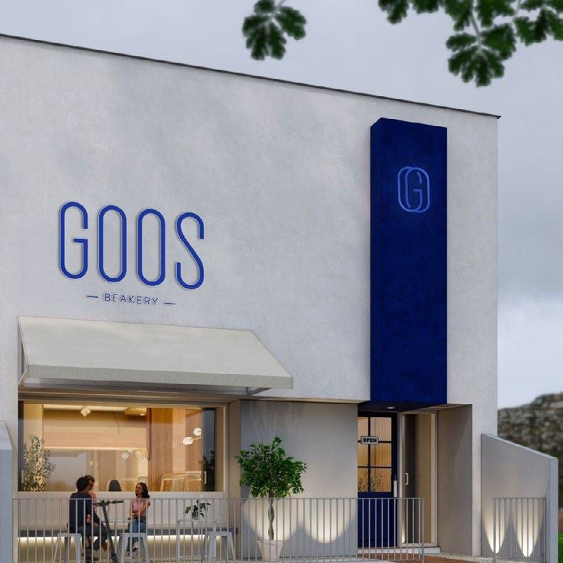
Storefront
The wordmark and monogram applied to the bakery's own storefront signage.
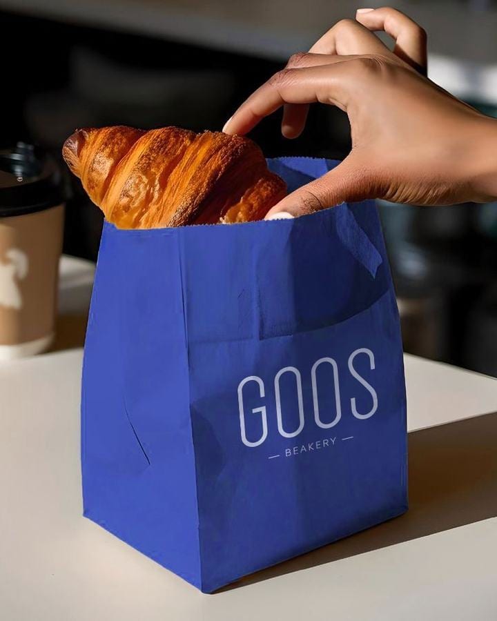
Packaging in Use
The pastry bag carried through to a real, everyday moment.
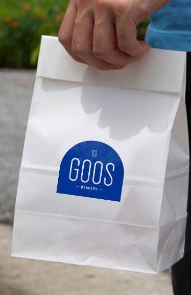
Paper Bag, Minimal Mark
The monogram alone, kept small and quiet on the plain paper bag.
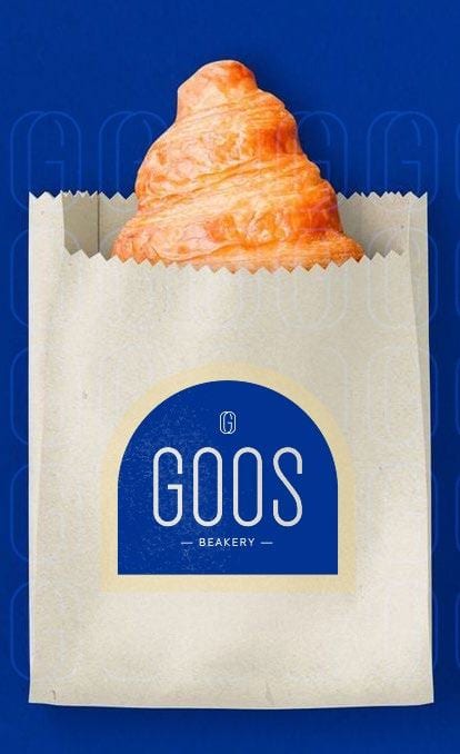
Bag Detail
A closer look at the monogram sitting on the arched bag silhouette.
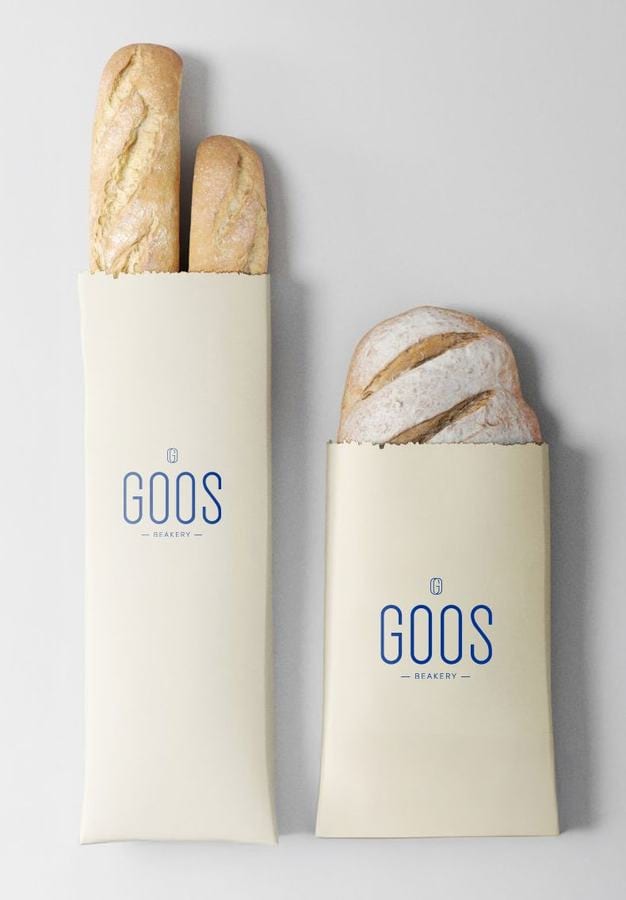
Bread Wrap
The repeating monogram pattern extended onto the bread packaging.
Next in Brand Identity